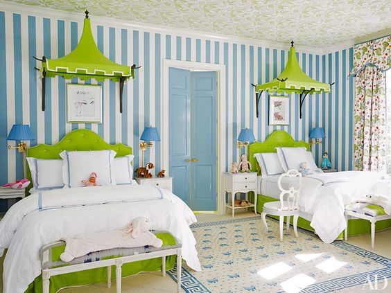
Pantone Color of the Year 2017

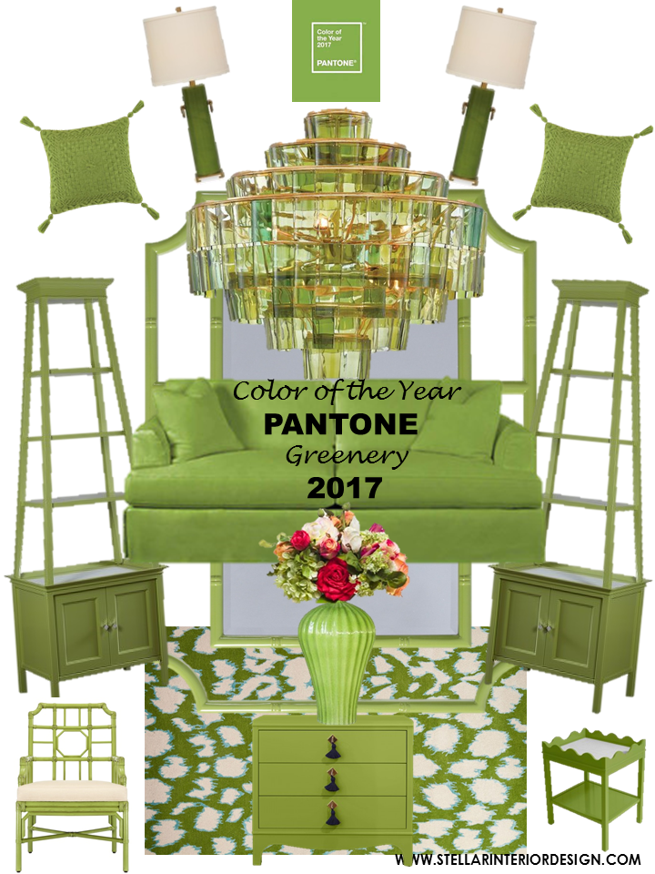
 PANTONE Color of the Year for 2017 is “Greenery”.  A fresh yellow green color that represents nature.  See how you can incorporate this color into your interiors.
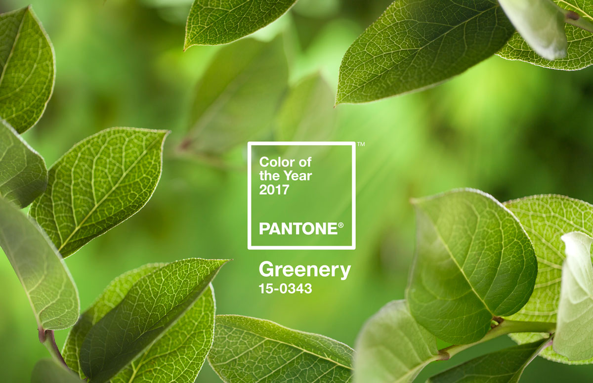
Greenery is nature’s neutral. The more submerged people are in modern life, the greater their innate craving to immerse themselves in the physical beauty and inherent unity of the natural world. This shift is reflected by the proliferation of all things expressive of Greenery in daily lives through urban planning, architecture, lifestyle and design choices globally. A constant on the periphery, Greenery is now being pulled to the forefront – it is an omnipresent hue around the world.

Nature’s neutral, PANTONE Greenery is a versatile “trans-seasonal” shade that lends itself to many color combinations. These palettes easily cross over fashion, beauty, product and graphic design applications.
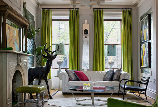
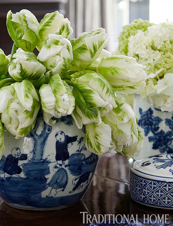
(Navy and Green Color Combo)
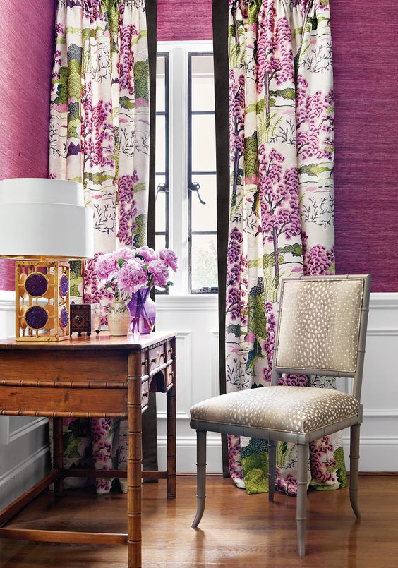
(Purple and Green Color Combo)

Color of the Year 2017~ Home Decor Trends in Greenery
Ready to breathe new life into your home or business?  For more information on our affordable online E-Design services contact me or if you’re locally in Southern California or Dallas contact me here.

Hospitality Design

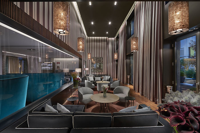
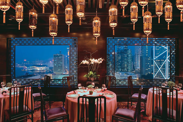
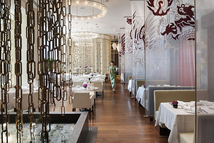
If your going to be traveling this holiday consider one of my favorite hotels.  I’m a fan of Mandarin Oriental!  They have luxurious hotels and residences all over the world with a timeless elegance.

Mandarin Oriental Milan

Mandarin Oriental Hong Kong

Mandarin Oriental Shanghai

Images via Mandarin Oriental

Holiday Centerpiece Decor Ideas

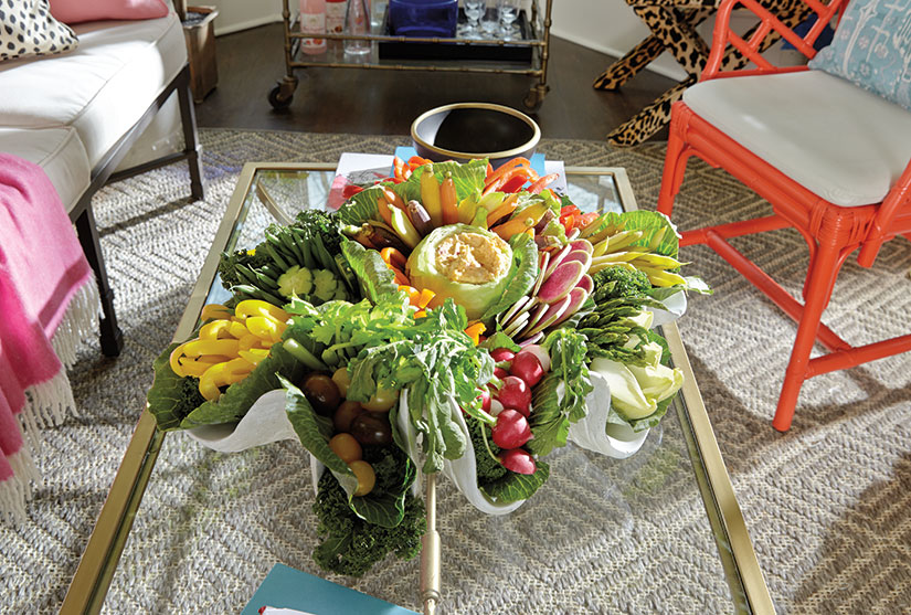
November is here and so are the holidays!  Watch Eddie Ross from Ballard Designs show us a genius way to create and display an edible centerpiece for the holidays.

eddieross_crudite_1

Eddie’s go-to vegetables are:

  • Cabbage (to hold the dip)
  • Kale (to create a leafy base)
  • Asparagus
  • Carrots
  • Celery hearts
  • Cherry tomatoes
  • Bell peppers (yellow, orange and red)
  • English cucumber
  • Endive
  • Haricot verts
  • Radishes
  • Waxed yellow beans

Eddie compares arranging a vegetable platter to creating a floral arrangement. “Think about where your color is going to be,” he offers. Group vegetables of similar shades together, such as pairing the carrots with the orange peppers, and you’ll end up with a beautiful spectrum of color. “The key is that there’s height and color and texture and it doesn’t just feel like flat vegetables in a bowl.”

For instructions on how to create this beautiful centerpiece visit the blog here.

Designer: Eddie Ross

Image: Ballard Designs

Shine By SHO Furniture

shine-by-sho-stellar-interior-design-com

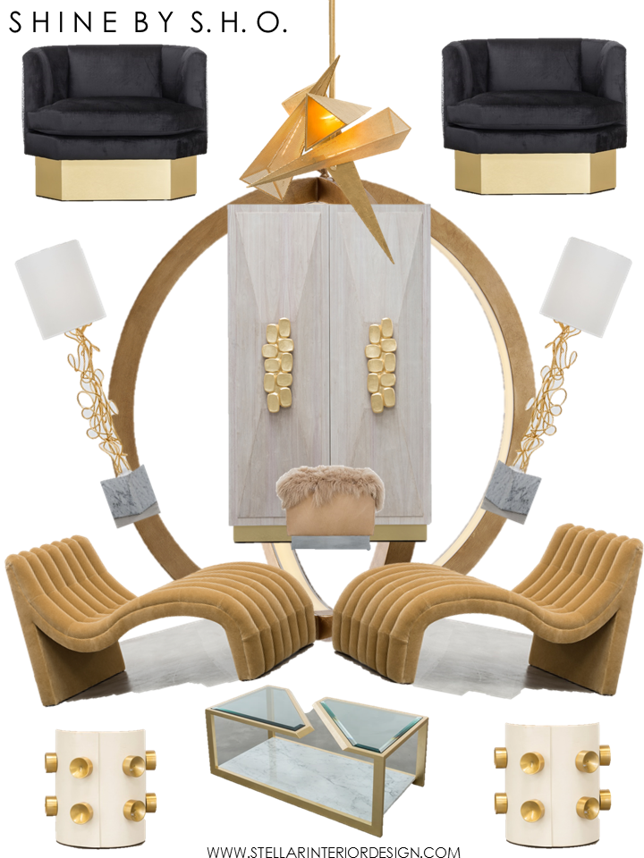
If you haven’t heard or seen the Shine by SHO furniture and lighting collection here is a peek of some of the current items that are available within their line that I love.  SUSAN HORNBEAK-ORTIZ designs have been a favorite of mine for a long time and I always enjoy popping into the showroom to see what she will come up with next.

Ready to breathe new life into your home or business?  We can help you get the look you want through our affordable online e-interior design services. To get started locally click here.

Kitchen Design Ideas

Kitchen Design Ideas

Home Depot carries Martha Stewart Living including a kitchen collection, the line has refreshing door colors and clever storage solutions.  If your thinking about an update for your kitchen or bathroom be sure to check out these helpful videos.

Ready to breathe new life into your home or business?  We can help you get the look you want through our affordable online e-interior design services. To get started locally click here.