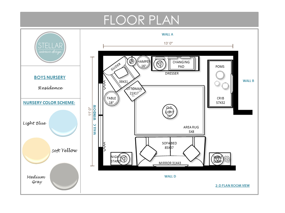
Hi friends! I recently had the pleasure of designing a nursery for a repeat e-client. She told me that she was going to be having a little baby boy and needed her guestroom that I designed last year converted into a new nursery/guestroom. The colors she wanted were yellow, blue and gray. Here is the design I put together:
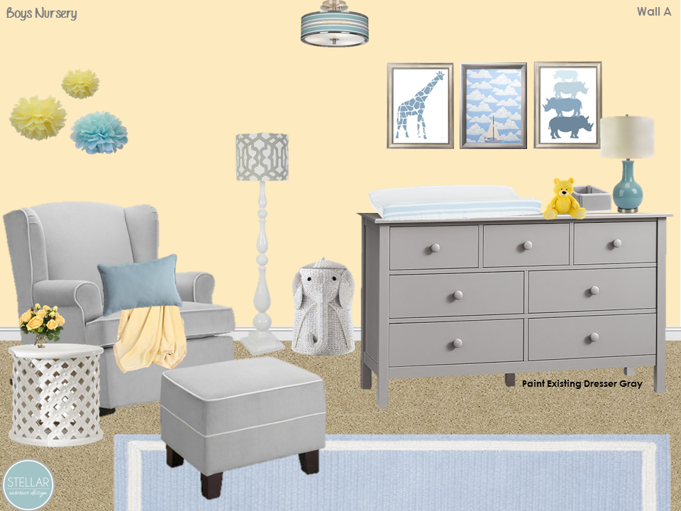
Wall A – My e-client wanted to keep her existing dresser and use it as a changing table. Since she was willing to do a little DIY we went with a gray paint for the dresser. This color will work great and grow with her little boy as he gets older.
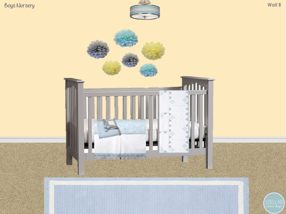
Wall B – includes the crib and selected bedding. Instead of going with the typical mobile I sourced tissue pom poms which are an affordable option and come in a variety of fun colors.
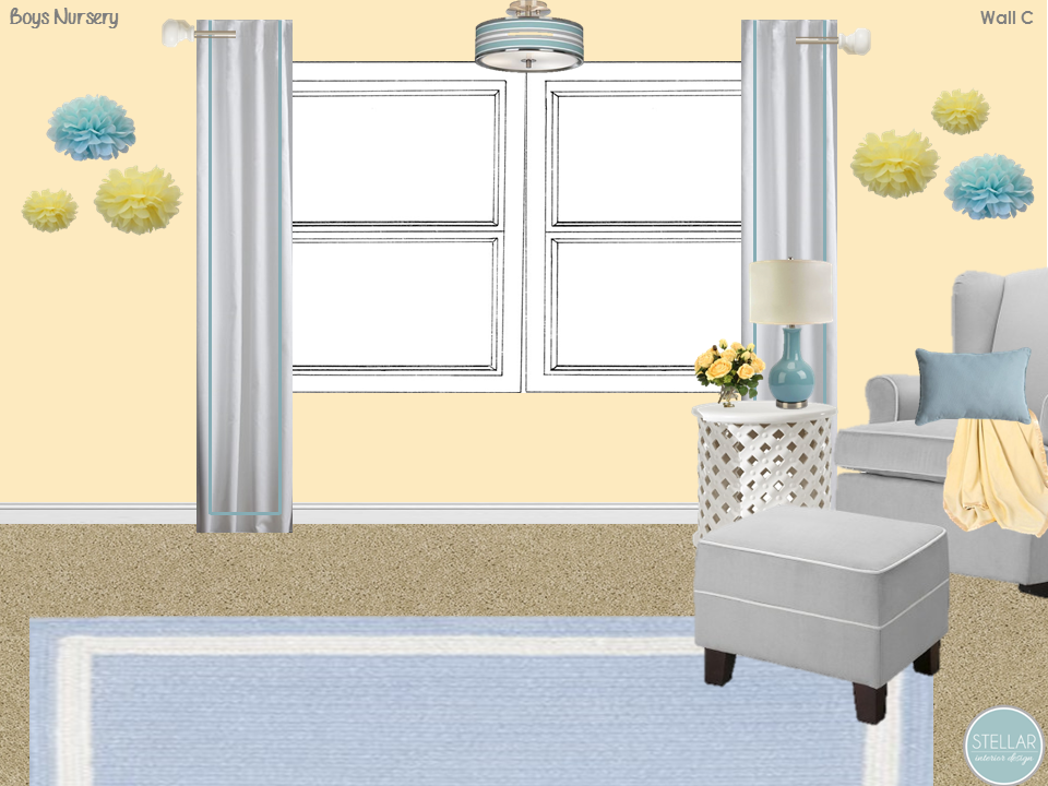
Wall C – features the window treatments and placements. The glider is by Ralph Lauren and the area rug is from Pottery Barn Kids.
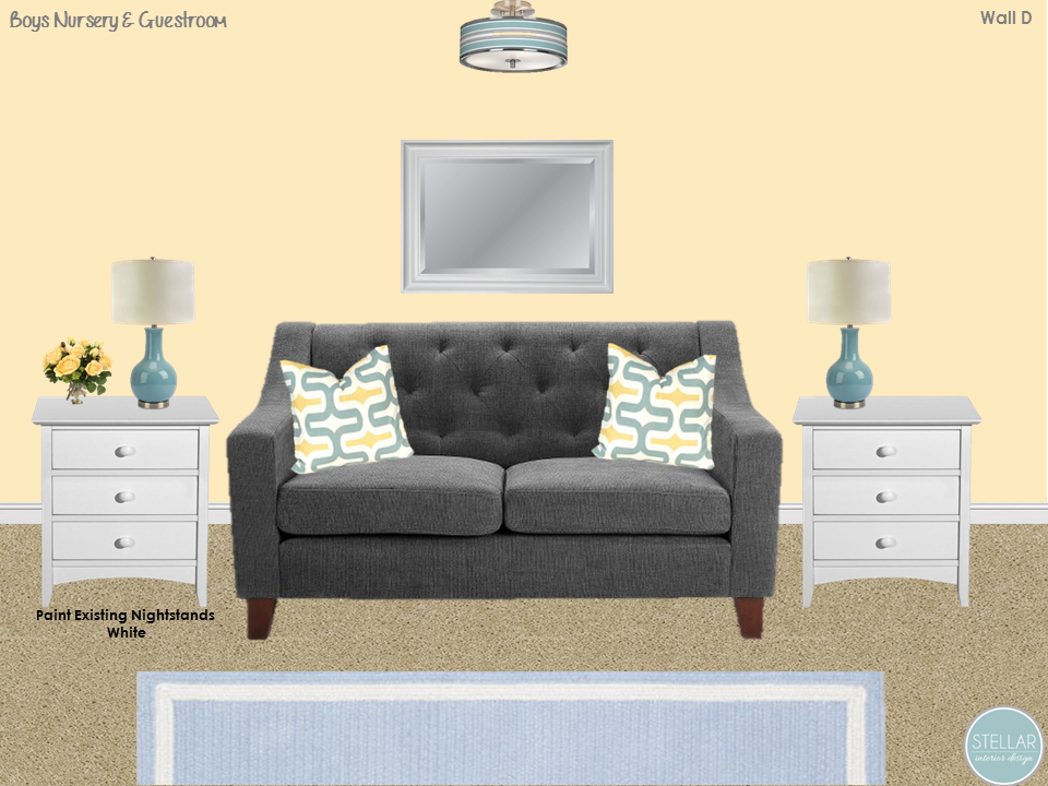
Wall D – My e-client also had the sofa bed and two nightstands and was on a budget, so again I recommended painting them but in white. She loved the final designs and now has a new nursery e-design and a comfy guestroom all in one.
The floorplan is full and functional with plenty of open floor space in the center of the room. This really helps clients envision how to layout their furniture and lighting properly.
For more information on my local or online interior e-design services visit my website.


